Design Systems
Blockboard Design System
I built the design system as a web server to update the design of our new product
The fight with fractured consistency had gone on long enough. So the system stopped being a document and became a deployment — a portal that regenerates itself from the repos that ship product code, serves live components and tokens over HTTP, and answers to coding agents over MCP. BlockVantage, Blockboard's greenfield self-serve layer, is the product assembled entirely out of what that server publishes.
Design Systems · Design Engineering · MCP Tooling
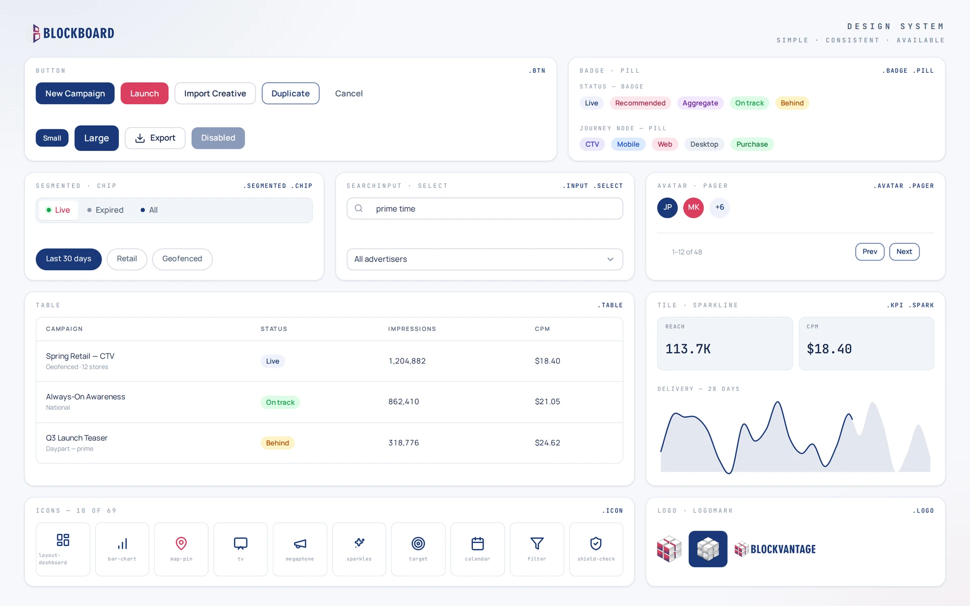
Fractured consistency, fought one screenshot at a time.
The Blockboard dashboard and the BlockVantage layer each grew their own buttons, tables, and chart colors — same brand, two dialects. Values lived in pasted hexes and cropped images, so nothing could be verified against a source and every dev handoff became a negotiation.
BlockVantage was greenfield — no legacy CSS, no habits to unwind. The chance to start the system right.
New product, first screens: every campaign card, wizard step, and chart could be born from tokens instead of retrofitted later — and the developers building it were already working through coding agents, so the system had to speak to both from day one.
Three words did the prioritizing.
Simple
A doctrine you can say out loud — navy is structure, crimson is commit — applied without consulting a chart.
Consistent
Every value generated from one token source. Raw hexes banned from product code — reference the variable or it doesn't ship.
Available
Copy-paste source with full dependency closures for developers — and an MCP server giving coding agents the same access.
What I Built
A server, and the app that runs on it
Two separate things carry this project, and it's worth naming them before the screenshots start. I wrote and deployed the design system as a web server. Then I built a shipping product whose entire interface comes out of it.
The server
A deployed portal at its own URL
Live component previews rendered by the actual product CSS, per-component props and copy-paste Vue 3 source, a machine-readable /tokens.json, and an MCP endpoint on the same deployment. It has routes. A person can open it, and so can an agent.
The app
BlockVantage, built out of what it publishes
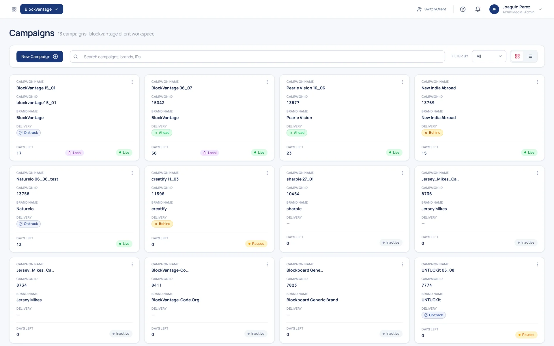
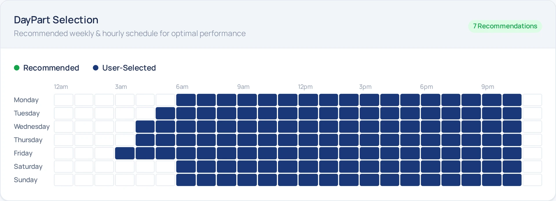
Blockboard's self-serve layer for streaming TV ads. Campaign grid, campaign wizard, charts, metric tiles, daypart heatmap — every screen is assembled from components copied out of the portal and painted by the token layer it serves.
How to read the images below
Thick blue outline — a route on the design-system server. The frame carries the path.
Thick green outline — BlockVantage in production. The frame carries the screen.
The Server
One URL, regenerated from the shipping repos
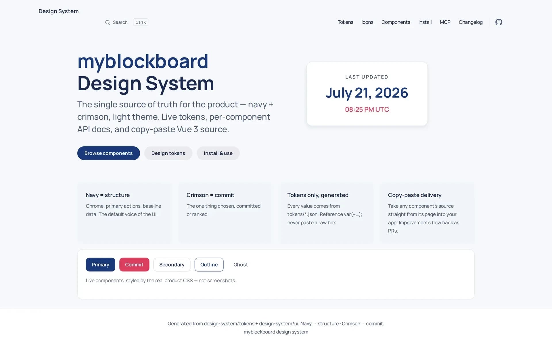
This is the home page. The doctrine is stated in four cards, the nav splits into Tokens, Icons, Components, Install, MCP, Changelog, and the row of buttons at the bottom is not an image of buttons — it's the Button component running, styled by the same CSS the product loads. A reader who wants the truth about a value clicks through to it instead of asking a designer.
Workflow
The server stamps its own build
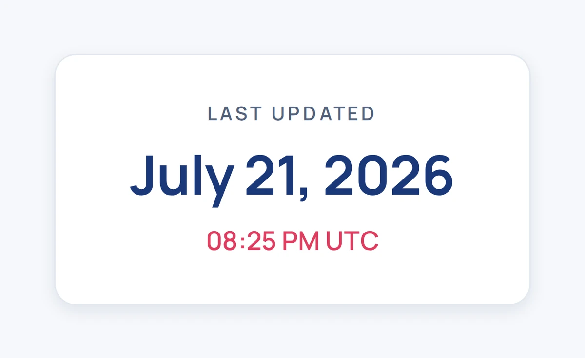
Top-right of that home page is a build stamp — the moment the site was last generated from source. Nothing here is hand-written: tokens, props, and component source all regenerate from the two repos, so the stamp is a freshness contract. If a component changed and this date didn't move, the pipeline didn't run and nobody should trust the page. It puts the state of the build where a developer — or an agent — reads it first, instead of leaving it buried in CI.
The Doctrine
Navy is structure. Crimson is commit.
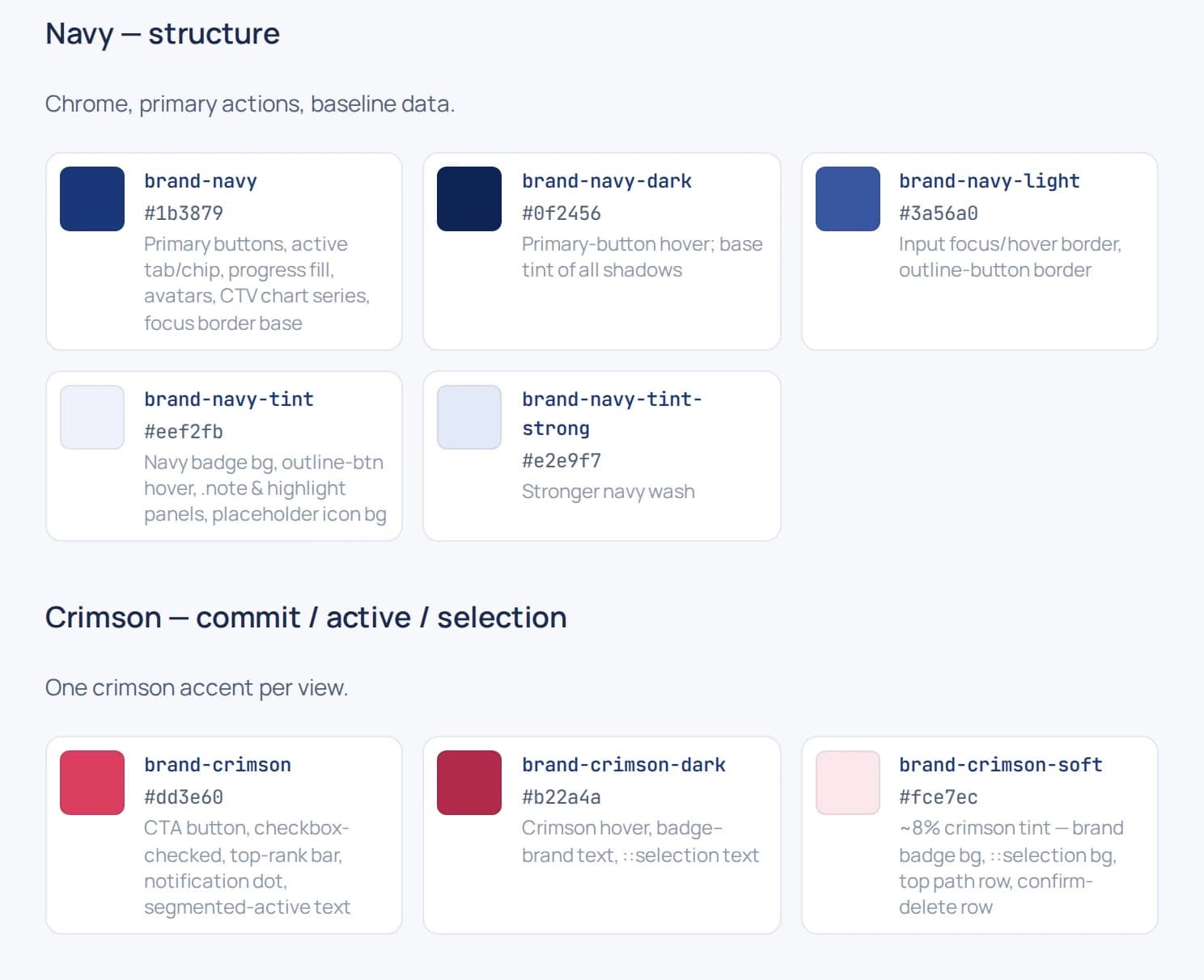
The whole color system reduces to a two-color semantic split. Navy is the default voice of the UI — chrome, primary actions, baseline data. Crimson is reserved for the one thing chosen, committed, or ranked, with one crimson accent per view. Everything else is surface, border, and text tiers derived from those two hues — even the elevation shadows are tinted with brand navy instead of neutral black, so depth reads on-brand.
Navy — structure
“Chrome, primary actions, baseline data. The default voice of the UI.”
Crimson — commit
“The one thing chosen, committed, or ranked. One crimson accent per view.”
Token Pipeline
Reference the variable. Never paste a raw hex.
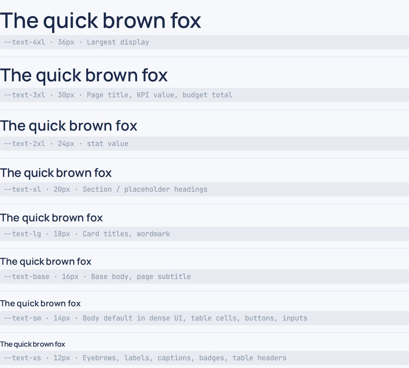
Every value in the system is generated from tokens/*.json — one source that fans out to the product CSS, the portal's live swatches, and a machine-readable /tokens.json endpoint. Type is Manrope for UI and JetBrains Mono for numerics, spacing sits on a 4px grid, and each token carries a usage description, so the catalog doubles as the spec.
"--color-brand-navy": {
  "value": "#1b3879",
  "type": "color",
  "group": "color.brand",
  "description": "Primary buttons, active tab/chip,
                  progress fill, avatars, focus border base"
}
Component Delivery
Live previews, copy-paste source
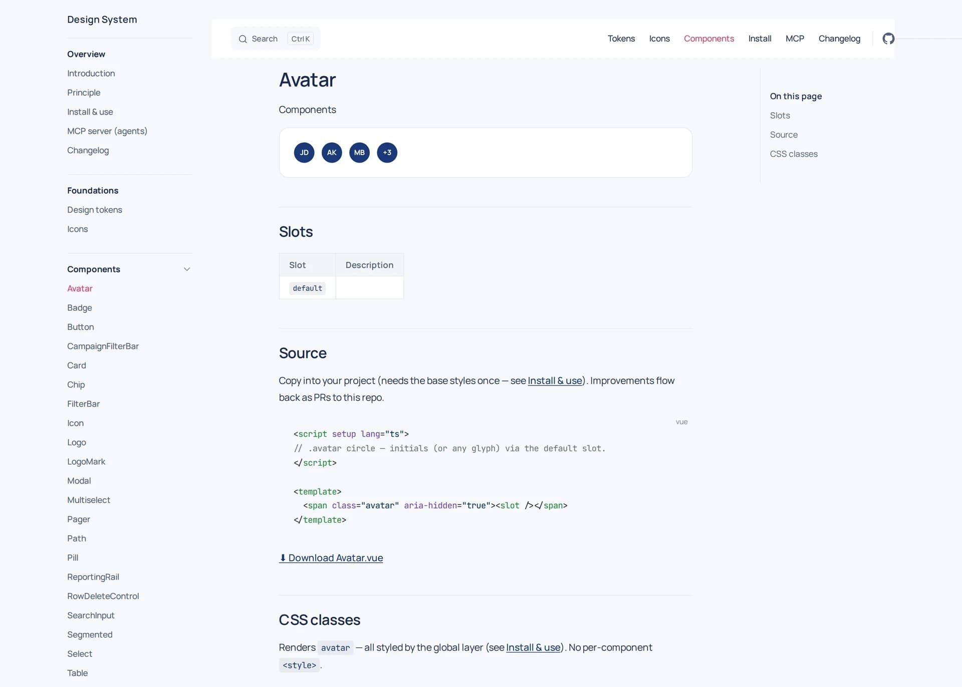
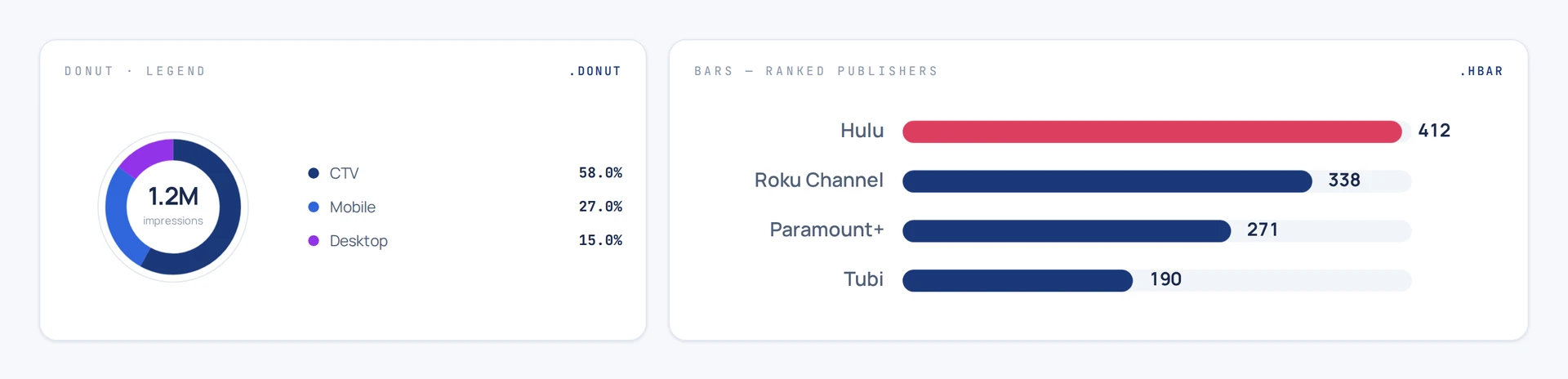
Every component gets a route on the server, and the page renders the real thing — styled by the actual product CSS, not screenshots — above its props table, its slots, its CSS classes, and its full Vue 3 source. There's no npm package to version-chase: consumers copy the source into their app, downloads resolve the complete dependency closure, and improvements flow back to the repo as PRs.

<script setup lang="ts">
import { computed } from "vue";
import Icon from "./Icon.vue";

// .btn family. `href` renders an <a>, otherwise a <button type="button">.
// `icon` is a leading icon; the default slot is the label. Extra classes
// and handlers fall through to the root element (Vue attr fallthrough).
const props = defineProps<{
  variant?: "primary" | "cta" | "secondary" | "outline" | "ghost";
  size?: "sm" | "lg";
  block?: boolean;
  icon?: string;
  href?: string;
}>();

const classes = computed(() => [
  "btn",
  props.variant ? `btn--${props.variant}` : "",
  props.size ? `btn--${props.size}` : "",
  props.block ? "btn--block" : "",
]);
</script>
Button.vue verbatim — components ship no <style>, so the copy lands in your app already speaking tokens
Built for Agents
The same server, spoken to over MCP
This is the migration path, and the reason the system is a deployment instead of a document. Developers on the team increasingly ship UI through coding agents — and a system their agents can't read is a system that gets ignored. So the same deployment that serves the portal also answers MCP over Streamable HTTP: nothing to install, and it can never drift from the pages a human reads, because it's the same generated content behind a different door. An agent discovers components, pulls one with its complete closure as ready-to-write files, and reads the tokens and brand rules in the same session — so the code it writes already obeys the design law. An llms.txt covers the agents that read before they call tools.
claude mcp add --transport http blockboard-design \
  https://[redacted]/mcp

# tools exposed to any agent:
#   list_components · get_component · search_components
#   get_tokens · list_icons · get_guidelines
> get_component("button")

{
  "files": [
    { "target": "src/ui/Button.vue", "content": "…" },
    { "target": "src/ui/Icon.vue",   "content": "…" },
    { "target": "src/ui/icons.ts",   "content": "…" }
  ],
  "props": [
    { "name": "variant",
      "type": "primary | cta | secondary | outline | ghost" }
  ],
  "cssBlocks": ["btn"],
  "install": {
    "note": "Components ship no <style>. Load the base
             style layer once (tokens + reference CSS).",
    "styles": "/tokens.css"
  }
}
One call returns the closure — every file with its target path, the props, the CSS blocks, and the install note. The agent writes files, not guesses
In the Product
Shipped screens, zero overrides
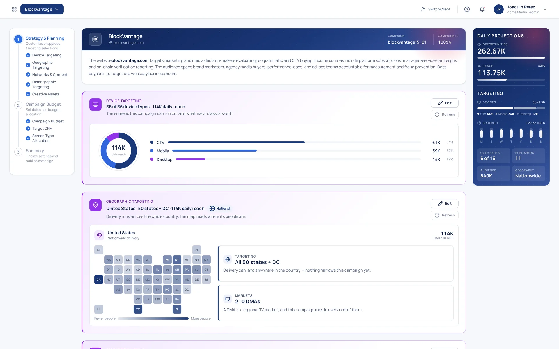
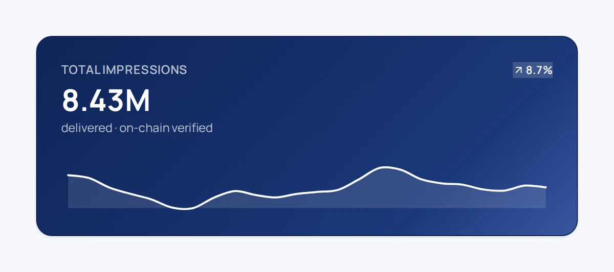
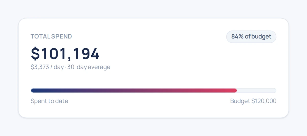
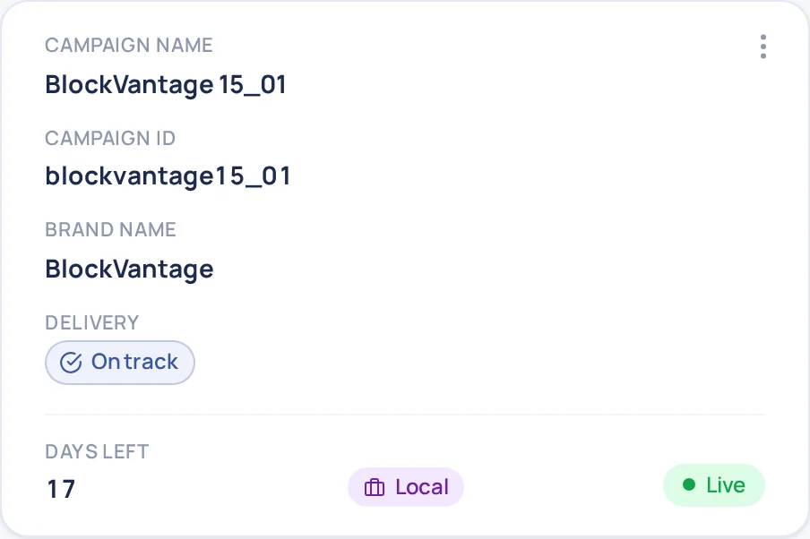
Everything up to here is the server. Everything below is the app it feeds. The BlockVantage dashboard is the system in production: the campaign grid, the wizard, and every chip and chart draw from the same token source the portal serves — no local overrides, no snowflake CSS. Where a screen commits, that's crimson; everything structural is navy.
Conclusion
Fewer errors, by construction
~70%
Less UI Build Time
a screen is assembled from 30 components instead of styled from scratch
~90%
Fewer Style Defects
raw values are refused at review, so off-brand color never reaches QA
100%
Token-Referenced
every color, space, and radius resolves through var(--…)
1
Command
onboards a coding agent — no spec handoff
~ figures are estimates from building on the system, not audited measurements
The gains are structural rather than heroic, and they follow from the one decision: shipping the system as a running server instead of a document.